
Your front door sets the tone before anyone steps inside, and one wrong color can throw everything off. I have seen homes look dull or harsh just because of a poor paint choice.
If you’re unsure what works, this focus on the colors you should never use at Home will help you avoid common mistakes.
You will learn which shades can clash, fade quickly, or require too much upkeep, and what to use instead.
This makes your choice easier and saves time, money, and effort while giving better results. Let’s fix your front door paint color and make it feel right from the moment you first look at it.
The Influence of Front Door Colors
The front door is far more than just a functional entryway; it is the defining focal point of your home’s exterior and the first architectural detail a visitor encounters. Acting as the visual anchor of the façade, it frames the entire composition of a home’s curb appeal.
A well-chosen front door color can upgrade even the most modest exterior, while a poor choice can completely undermine an otherwise beautiful home.
Refined blue-gray tones like Debonair SW 9139 are increasingly appearing on front doors precisely because they strike that balance between calm authority and quiet personality.
Beyond appeal, color psychology plays a pivotal role in design decisions: warm hues signal a welcoming, friendly atmosphere, cool tones project calm authority, and bold choices communicate a unique personality.
Understanding these dynamics is essential before committing to any front door color for your home’s perfect look.
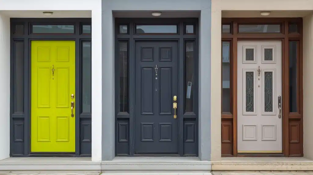
Three Front Door Paint Colors to Never Use
Your front door is the first thing visitors notice; choosing the wrong color can undermine your home’s entire curb appeal before anyone even steps inside.
While personal taste always plays a role, certain colors consistently create problems that go beyond appeal.
Here are three front door paint colors worth reconsidering before you pick up that brush.
1. Bright or Neon Colors
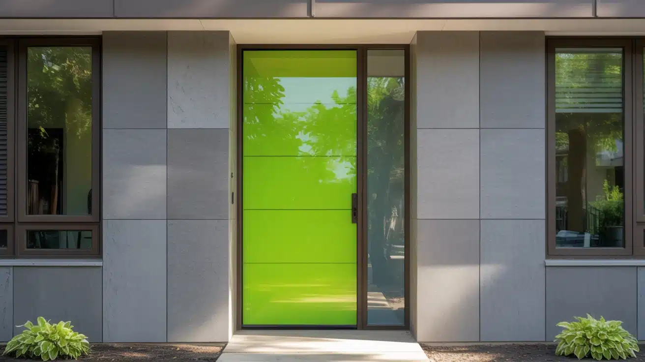
Bright and neon colors might feel exciting on a mood board, but they rarely translate well onto a front door.
These high-intensity shades can overwhelm your home’s exterior, clash with natural surroundings, and create a visual imbalance that feels unsettling rather than welcoming.
What looks bold in theory often reads as harsh and uninviting in practice, particularly against brick, stone, or neutral siding.
Over time, extreme saturation also fades unevenly, leaving your door looking worn far sooner than expected.
You can consider these alternatives instead for your project next time:
- Sherwin-Williams Smoky Blue (SW 7604): A muted, urbane blue that adds character without overwhelming your exterior palette.
- Benjamin Rooftop Garden (CSP-765): A deep, earthy green that feels grounded, natural, and effortlessly stylish on any door.
- Farrow & Ball Mizzle (No.266): A soft, complex sage green that blends beautifully with both modern and traditional home styles.
2. Dark Colors Without Natural Light
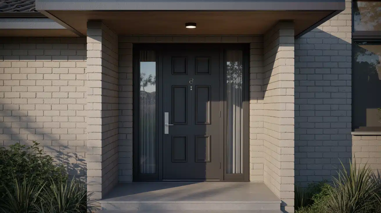
Dark shades like deep black or heavy brown can look strikingly sleek on the right home, but without adequate natural light, they quickly turn oppressive and uninviting.
A shadowed entryway paired with a very dark door creates a visually heavy entrance that feels closed off rather than welcoming.
Beyond appeal, dark colors absorb significantly more heat, accelerating paint deterioration and causing fading, peeling, and cracking far sooner than lighter alternatives would.
For your next project, you can consider these alternatives:
- Sherwin-Williams Charcoal Blue (SW 2739): A rich, deep neutral that retains refinement while reflecting slightly more light than true black
- Benjamin Moore Slate Teal (2058-20): A refined slate tone that brings depth and interest without swallowing light from your entryway
- Behr Brodway (PPU18-20): A warm charcoal gray that feels strong and contemporary without creating an oppressive, lightless entrance
3. White (If Not Maintained Properly)
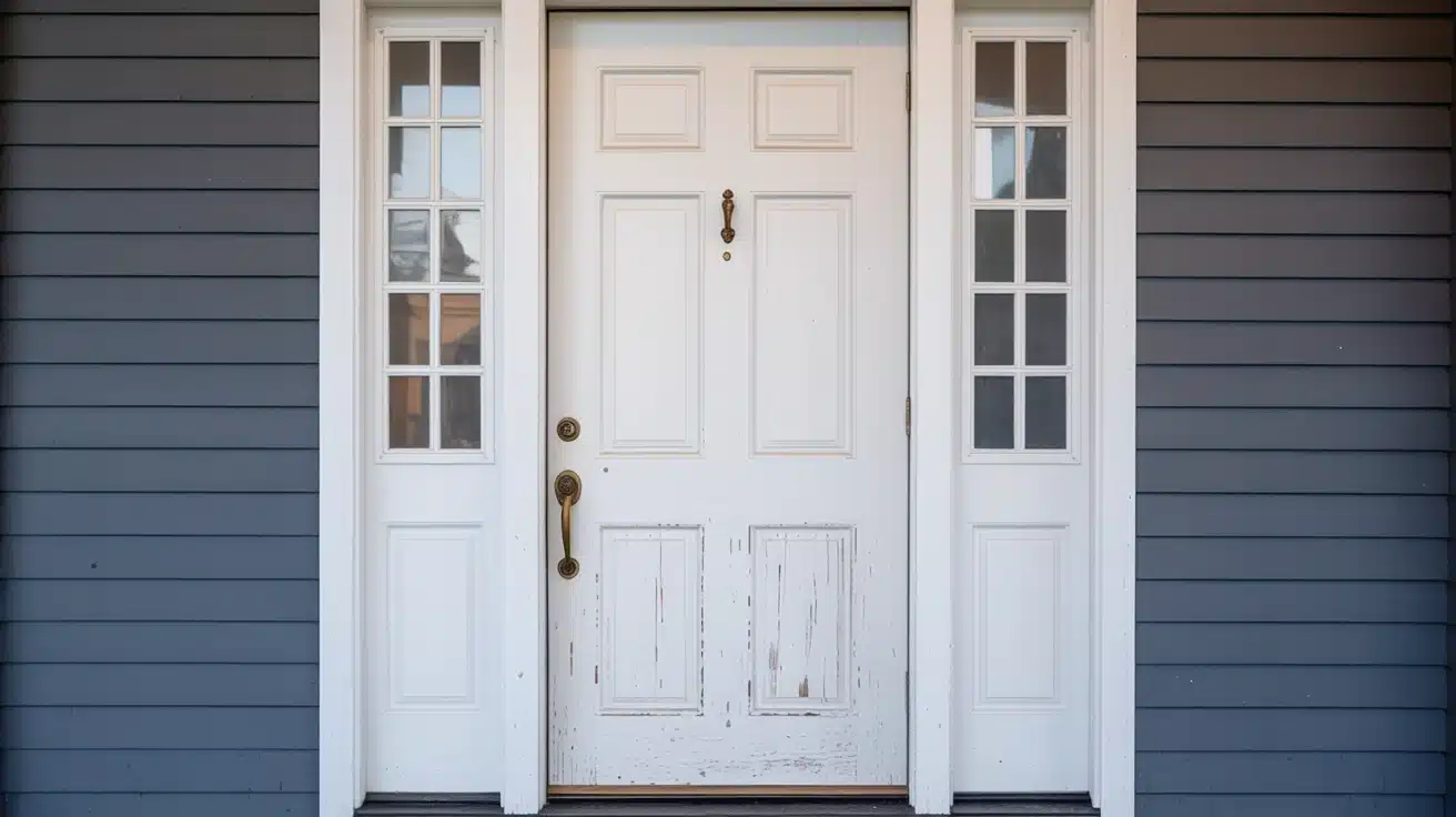
White feels like the safe, classic choice for a front door, and in theory, it is.
But in practice, a white front door demands relentless upkeep. It attracts dirt, scuffs, and staining faster than almost any other color, and without regular cleaning and repainting, it quickly shifts from crisp and graceful to tired and neglected.
Against certain exterior styles, white can also read as flat and personality-free, blending into the facade rather than creating the welcoming focal point your entrance deserves.
Consider these alternatives if you want next time:
- Sherwin-Williams Alabaster (SW 7008): A warm, creamy off-white that hides minor marks far better while retaining that clean, bright appeal.
- Benjamin Moore White Dove (OC-17): A soft, slightly warm white with gentle depth that feels refined and far more forgiving than stark pure white.
- Farrow & Ball Pointing (No.2003): A warm antique white with subtle complexity that adds quiet classiness without the harsh maintenance demands of bright white.
Front Door Color Ideas That Stand the Test of Time
Avoiding the wrong front door color is only half the battle; choosing the right one is where your home’s personality truly begins. Here are seven alternatives that deliver lasting curb appeal.
| Color | Why It Works | Perfect For | Vibe |
|---|---|---|---|
| Soft Pastels | Light pink, mint, or powder blue create calm without overpowering | Modern, coastal, neutral exteriors | Gentle & serene |
| Earthy Tones | Olive, terracotta, and warm brown blend naturally with wood and stone | Rustic, farmhouse, nature-inspired homes | Grounded & natural |
| Warm Neutrals | Taupe, beige, and soft mocha pair effortlessly with almost any exterior | Traditional homes, mixed-style neighborhoods | Cozy & classic |
| Charcoal or Slate Gray | Dark yet understated, creates a sleek modern look without heaviness | Contemporary, minimalist, lighter exteriors | Sleek & urbane |
| Classic Navy Blue | Bold enough to stand out, refined enough to stay timeless | Colonial, cottage, beach-style homes | Calm & stately |
| Bold Red or Burgundy | Adds personality and warmth without feeling loud or overwhelming | Traditional, Victorian, neutral exteriors | Warm & inviting |
| Black (With Caution) | Classic and striking, especially paired with gold or brass hardware | Modern, minimalist, classic-style homes | Sleek & bold |
Each of these shades brings its own distinct character while standing the test of time. As part of the wider move toward colors replacing gray, deeper options show just how much personality a single door color can carry when matched thoughtfully to your exterior, architecture, and surrounding landscape.
How to Choose the Perfect Front Door Color
Choosing the right front door color starts with testing paint samples directly on your door, observing how they shift across morning, afternoon, and evening light before committing.
Beyond aesthetics, consider what your chosen color communicates: red signals warmth and energy, blue evokes calm and trust, while black projects quiet confidence.
It also helps to browse current design trends, not to follow them blindly, but to understand which directions feel fresh yet enduring.
The perfect front door color balances your personal style, your home’s exterior palette, and the lasting impression you want every visitor to carry away.
Common Mistakes to Avoid When Painting Your Front Door
Even the best color choice can fall flat if the application goes wrong. Avoid these critical mistakes first.
- Finish Matters: Choosing the wrong finish, matte, satin, or gloss, can drastically affect how your door’s color looks and wears.
- Surface First: Skipping proper cleaning, sanding, and priming leads to peeling, uneven coverage, and a paint job that deteriorates quickly.
- Patience Pays: Rushing coats without allowing adequate drying time between layers results in streaks, bubbling, and an unprofessional finish.
- Color Isolation: Never choose your door color in isolation; always evaluate it alongside your siding, trim, and hardware.
Nail these basics and your front door will look professionally painted, polished, and picture-perfect for years.
Frequently Asked Questions (FAQ)
How do undertones affect paint colors in different rooms?
Undertones can shift with lighting and nearby colors, making the same shade look warmer, cooler, lighter, or slightly dull in different spaces.
Should ceilings and trim use the same paint color as walls?
Using the same color creates a smooth look, while different trim shades add contrast and help define edges, door, and architectural details.
How often should you repaint to keep colors looking fresh?
Most walls need repainting every five to seven years, but busy areas may require updates sooner due to marks, fading, and regular wear.
Can neutral paint colors work with bold furniture or decor?
Yes, neutral shades act as a steady base, helping bold furniture stand out clearly without making the space feel too busy or cluttered
Final Touch
Choosing the right front door color can make or break how your home feels from the outside. I have seen how small paint choices can change the whole look fast.
You now know why neon shades feel harsh, dark tones need light, and white needs care to stay clean. You also have safer color ideas that hold up better over time.
This helps you avoid wasted effort, extra costs, and a door that feels off.
When you follow this Front Door Paint: Three Colors to Never Use at Home Guide, your entry looks more welcoming and balanced.
Try a new shade, test it in daylight, and see the difference. Share your results or check more ideas next!